
You after you make your first data visualization^
In this workshop you will use python to create basic graphs and visualizations with real data. First we start off with simpler graph visualizations, and learn how to make them more personalized and complicated! You can hand draw a graph anytime you want, but why not learn how to code one! You will learn and use matplotlib, pandas, and numpy, so you can create any graph or visualization you dream of!
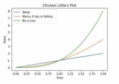
Here is an example of something you will have coded after the workshop:
Source Code of Example:
import pandas as pd
import matplotlib.pyplot as plt
import numpy as np

x=np.linspace(0,2,100)
fig,ax=plt.subplots()
ax.plot(x,x,label='Sleep')
ax.plot(x,x**2,label='Worry if sky is falling...')
ax.plot(x,x**3,label='Be a icon')
ax.set_xlabel('Time') #adds X axis label
ax.set_ylabel('Years') #adds Y axis label
ax.set_title("Chicken Little's Plot") #adds a title
ax.legend() #adds a key of the graph
Getting started!
Get started by going to Jupyter. When you get to the website you will see something like this...

Click the middle one (Try JupyterLab)!
Jupyter will spin up a coding environment right in your browser! After a few seconds, you should see this:
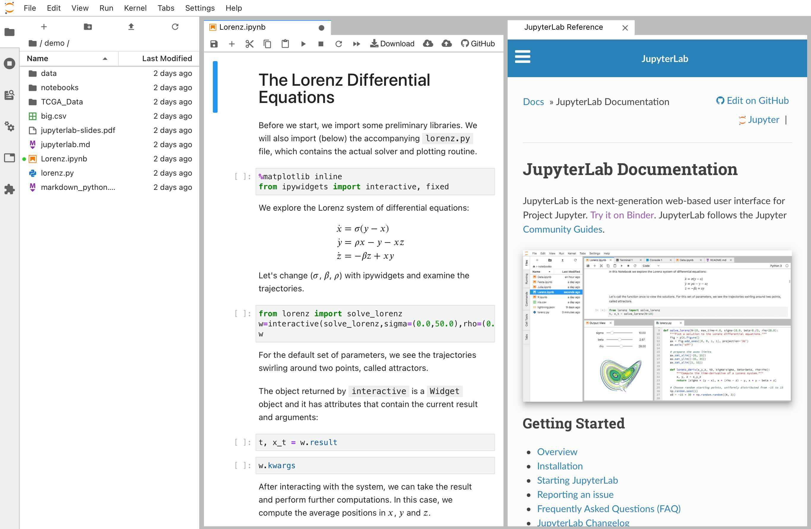
Click the + button at the top left, then select Notebook –> Python 3.
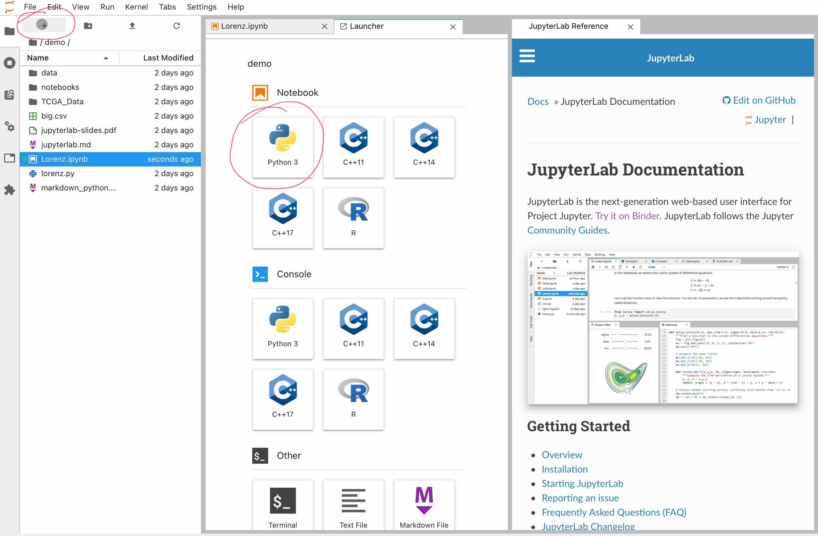
You should see a new untitled Juypter notebook.
Never used Jupyter? Here's a quick introduction/tutorial to Jupyter!
Uploading Libraries!
First, we need to upload the libraries we will be using for this project. Every programming language has different “classes” that you need to use to access specific variables. The same thing occurs in Python, but instead they are known as libraries.

In this workshop we will be using pandas, numpy, and matplotlib.
Pandas: This is not the furry animal you are thinking of, pandas is a efficient and easy way to use open source data analysis.

Matplotlib: This is a plotting library using a numerical mathematics extension Numpy.
Numpy: This is a python library that is very good with hard mathematical functions and arrays.
Simple Line Plot!
Note: Customize your plots and graphs! (Labels, Values, etc.)
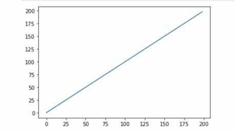
On the first line of your new untitled Jupyter notebook, add the following code:
import pandas as pd
import matplotlib.pyplot as plt
The above code imports Pandas and Matplotlib into this project so we can have access to certain variables and methods available in these libraries!
Under those two lines, add:
x=[x*2 for x in range (100)]
y=[y*2 for y in range (100)]

plt.plot(x,y)
This code segment will create the ranges on our x and y axis and plt.plot will plot the points we want! In this example there are no specific points being plot though, we are just making a basic linear function.
Finally, add:
#showing graph
plt.show()
This line will show the graph and points we plotted, basically giving the user an output.
plt.show()–> shows the graph output.plt.plot(x,y)—> plots your points.
Click the play button near the top of your window.
You should get something that looks like this...
Simple Bar Graph!
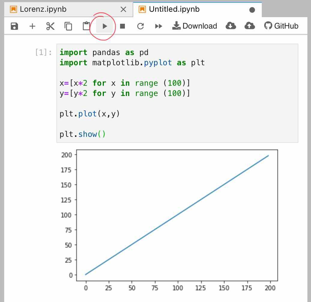
In a new section of your Jupyter notebook, add:
import pandas as pd
import matplotlib.pyplot as plt
import random
This code above imports the libraries again. Notice that we import another library called random. This will allow for a random number to be chosen each time we have a y value. You'll be able to see this later in our code!
Next, add:
x=['Tacos','Burritos','Churros']
y=[random.randint(0,30), random.randint(0,90),random.randint(0,10)]
plt.bar(x,y)
plt.show()
The code above names each of the bars (defines x and y lines), creates random values of Y using random.randint(), plots our points, and shows the graph!
When you click the play button again, you should see something like this:
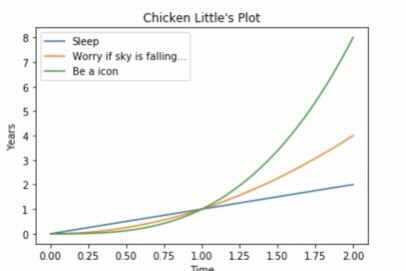
Let's Make It A Little More Complicated!
We are going to make a more personalized graph using three different functions.
Step One!
I am sure you all have already guessed it hehe, import your libraries!!!!!!!!!!

import matplotlib.pyplot as plt
import numpy as np
Notice that we will be using numpy this time! :)
Hold up...what does matplotlib even do?
I am sooooo glad you asked!
To create the graph we want to make we will be using the matplotlib library! It will...
-
Create an outline
-
Create axes
-
Create axes ranges
-
Allow us to plot points

Okay now lets get back to it...
Make sure your libraries are imported!
Step Two!
The code below creates the skeleton of a graph, plots points, and shows output!
#creates figure (graph skeleton)
fig,ax=plt.subplots()
#plots points
ax.plot([1,2,3,4],[1,4,2,3])
plt.show()
Something new you may have noticed is the use of fig, or aka figure.
In the code above, and anytime you want to create a graph you will be using fig. For example, in our code so far we have used…
fig,ax=plt.subplots()
...which creates a figure with a single axis.
Here are a few different ways you can use fig:
fig=plt.figure() #creates empty graph returns with num. figues
fig,ax=plt.subplots(2,2) #creates 2 graph figues
Check it out in your Jupyter Editor!
Can you tell I have a strange fascination with random things dancing hehe!
Step Three!
Make sure libraries are uploaded, look back @ Step Two if needed.
Set up spacing of your x and y axis...
x=np.linspace(0,2,100)
*Make sure your libraries are uploaded!
Step Four!
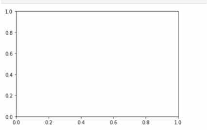
Create a figure! Scroll back up to see how to write that code... Here's a hint:
fig,ax=plt._____()
Still stuck? Where the underscores are, replace with fig,ax=plt.subplots().
Your graph should look something like this...
Step Five!
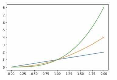
Now we can plot some lines, in this part customize it however you want!
This example is going to have 3 basic functions (linear, squared, and cubed) but you can fancy yours up any way you want!
ax.plot(x,x,label='Sleep')
ax.plot(x,x**2,label='Worry if sky is falling...')
ax.plot(x,x**3,label='Be a icon')
label= will be the name of your line
ax.plot will plot your points/lines
Your graph should look something like this...
Step Six!
Finishing touches!

ax.set_xlabel('Time') #adds X axis label
ax.set_ylabel('Years') #adds Y axis label
ax.set_title("Chicken Little's Plot") #adds a title
ax.legend() #adds a key of the graph
You could possibly get something that looks like this...
If you are having any issues make sure to check your top right corner to check if the "kernel" is on and is set to Python 3

All Example Code:
import pandas as pd
import matplotlib.pyplot as plt
import numpy as np

x=np.linspace(0,2,100)
fig,ax= plt.subplots()
ax.plot(x,x,label='Sleep')
ax.plot(x,x**2,label='Worry if sky is falling...')
ax.plot(x,x**3,label='Be a icon')
ax.set_xlabel('Time') #adds X axis label
ax.set_ylabel('Years')#add Y axis lable
ax.set_title("Chicken Little's Plot") #adds a title
ax.legend() #adds a key of the graph
**PS. If you have never watched Chicken Little, you must do that asap, you are missing out on an animated masterpiece.

Share Your Project!
How can I save my project with Jupyter? Click here for video!
- Press File in the upper right hand corner
- Press "Save Notebook As"
- Save the Notebook as a .ipynb file
- Then if you ever wanted to come back to this code you can upload the .ipynb file back into Jupyter and edit it!
Hacking!
Add raw data from the web into your graphs.
OR Follow full workshop using that covid-19 data with Visualizing Covid-19 Data By: Nic Piepenbreier!!!
Heavily personalize your graph (like I did with Chicken Little)! -Google code for different kinds of graphs (dot plot, pie charts, etc.)
Make multiple different kinds of graphs/visualizations.
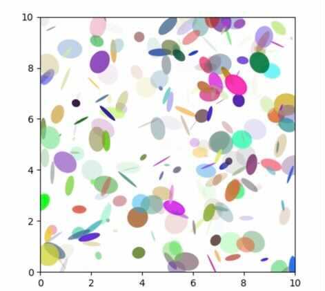
import matplotlib.pyplot as plt
import numpy as np
from matplotlib.patches import Ellipse

np.random.seed(19680801)

NUM = 250

ells = [Ellipse(xy=np.random.rand(2) * 10,
                width=np.random.rand(), height=np.random.rand(),
                angle=np.random.rand() * 360)
        for i in range(NUM)]

fig, ax = plt.subplots(subplot_kw={'aspect': 'equal'})
for e in ells:
    ax.add_artist(e)
    e.set_clip_box(ax.bbox)
    e.set_alpha(np.random.rand())
    e.set_facecolor(np.random.rand(3))

ax.set_xlim(0, 10)
ax.set_ylim(0, 10)

plt.show()

#Source: https://matplotlib.org/gallery/shapes_and_collections/ellipse_demo.html
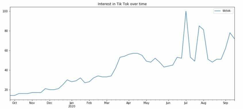
Look up how to import Google Trends into your graph!
Demo Code:
import pandas as pd
import matplotlib.pyplot as plt
import numpy as np
import random

tiktok=pd.read_csv('multiTimeline (7).csv', header=1)

#for the csv file you need to download the graph off of google trends than uploaed it into jupyter notebook, than you copy the path and put it were multiTimeline (7).csv is.

cols = tiktok.columns
cols = [x.split()[0].lower() if len(x.split())>2 else x.lower() for x in cols]
tiktok.columns=cols

tiktok['week']= pd.to_datetime(tiktok['week'])
tiktok = tiktok.replace('<1', 1)

tiktok.set_index('week', inplace=True)

tiktok.plot(figsize=(14,6))

plt.title('Interest in Tik Tok over time');
Need help adding the Google trends data? Click here!