
Join Hack Club Horizons! Ship your projects and fly to your first hackathon →
You probably must have built navbars for your websites. It is a challenging task for many of us to make a good and responsive navbar. Well, today we'll be building a fully responsive navbar! It is not only easy to build but also very smooth and beautiful!
But first, Let's have a look on various navbars on the internet:
The responsive nav:
The simple nav:
Or even this?
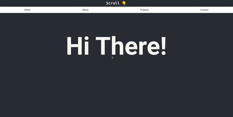
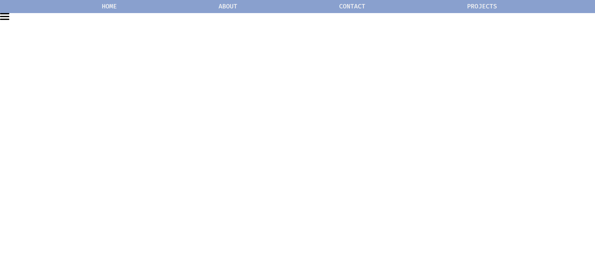
And this is what we'll be building today!
Here's a sneak peek:
Here's the live demo.
Here's the source code.
Part 1: Prerequisites
You should have a beginner understanding of:
- HTML
- CSS
- JavaScript
Part 2: Setup
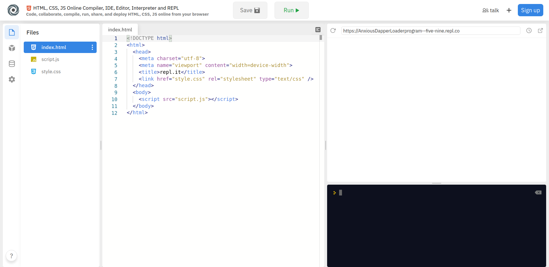
Setting up your code environment on Repl.it
Repl.it is an online code editor. You don't have to use Repl.it but I suggest you do as it sets everything up for you and you don't require any installations.
To get started, go to https://repl.it/languages/html. Your coding environment will spin up in just a few seconds!
You should see something like the following:
Part 3: Building the project
1) HTML
Let's start writing the HTML code required in the index.html file. We'll write all our code inside the <body></body> tags.
NOTE: Make Make sure the <script> tag, which is in your body, is just above the closing </body> tag and whatever code you write in the <body> should be above that <script> tag or else it will throw you errors.
First, we'll build a simple structure of the Navbar:
<body>
  <nav class="navbar">
    <ul class="elements">
      <li class="nav-el">HOME</li>
      <li class="nav-el">ABOUT</li>
      <li class="nav-el">CONTACT</li>
      <li class="nav-el">PROJECTS</li>
    </ul>
  </nav>
  <script src="script.js"></script>
</body>
Explanation: In the <nav> element, we create an unordered list (<ul>) with the list items (<li>) as navlinks.
Also, the <nav> element has a class of navbar, the <ul> has a class of elements, the <li> has a class of nav-el and as always, the <script> tag is below all these lines.
Now, we will also create a burger button which will only be visible for smaller screens and it will make the navbar pop up from the side. It will come below the unordered list inside the <nav> element.
<div class="burgerDiv">
  <div class="rows">
    <div class="span"></div>
    <div class="span"></div>
    <div class="span"></div>
  </div>
</div>
Explanation: The burger button lines will be nested inside 2 <div> tags. Similarly, the first parent <div> has a class of burgerDiv, the second parent <div> has a class of rows and each of the burger lines have a class of span.
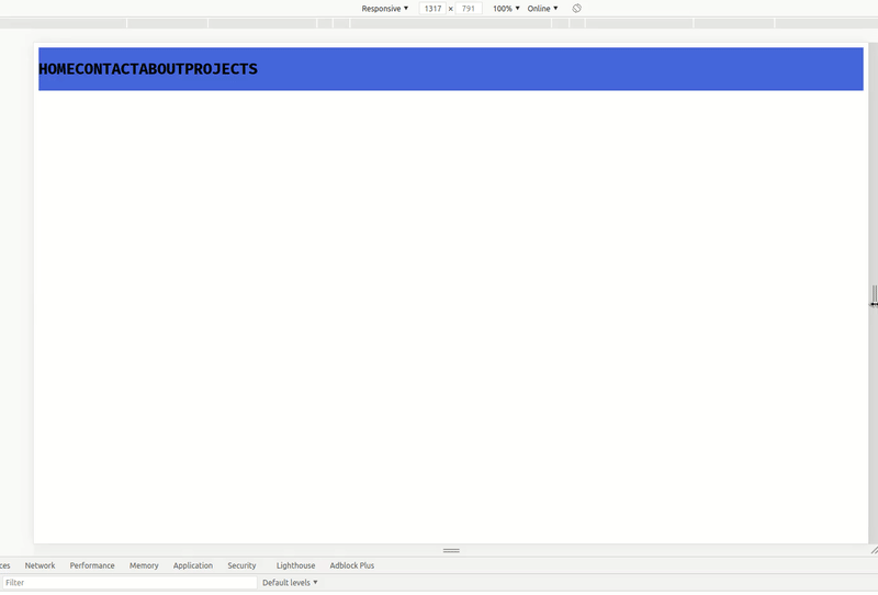
If you run the code now, you will see an unordered list in the preview similar to this:
Umm... Why didn't our button render? That's because its default width and height are 0 pixels. We will need to specify its size in the CSS.
The HTML code so far:
  <!DOCTYPE html>
  <html>
  <head>
    <meta charset="utf-8" />
    <meta name="viewport" content="width=device-width" />
    <title>Responsive Navbar</title>
    <link href="style.css" rel="stylesheet" type="text/css" />
  </head>
  <body>
    <nav class="navbar">
      <ul class="elements">
        <li class="nav-el">HOME</li>
        <li class="nav-el">ABOUT</li>
        <li class="nav-el">CONTACT</li>
        <li class="nav-el">PROJECTS</li>
      </ul>
      <div class="burgerDiv">
        <div class="rows">
          <div class="span"></div>
          <div class="span"></div>
          <div class="span"></div>
        </div>
      </div>
    </nav>
    <script src="script.js"></script>
  </body>
  </html>
Without any further ado, let's move on to the CSS!
2) CSS
Navigate to the style.css file and let's start by removing the default margin and the default padding from all the elements. To do that, we'll simply write:
* {
  margin: 0;
  padding: 0;
}
Next we will style the <ul> so that it looks more like a navbar and not a list.
The <ul> tag was given a class of elements. So we will give styles to elements class.
.elements {
  display: flex;
  justify-content: space-evenly;
  list-style: none;
  padding-top: 10px;
  padding-bottom: 10px;
  color: whitesmoke;
  font-weight: 500;
  font-size: 20px;
  background-color: #89a0ce;
  transition: 0.5s cubic-bezier(0.075, 0.82, 0.165, 1);
}
Woah woah woah. Too much of CSS in one go, right? Don't worry, I'll explain you everything line by line.
Explanation: We make the display of that element to flex so that we can align it horizontally. Then we give a property of justify-content: space-evenly; so that the contents inside the elements are spaced properly.
An elaborate explanation of justify-content and its various properties:
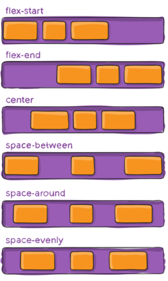
Image courtesy: css-tricks.com
Next, we have the list-style: none; which will remove the bulleted points which are default to unordered lists. Then we give the element some extra space on top and bottom using the padding-top: 10px; and padding-bottom: 10px;
Next, the color, font-weight, font-size properties are defined which will affect the text inside the element. The background-color: #89a0ce; property is pretty much self explanatory. Then we give it some transition properties of 0.5 seconds as the transition duration and the transition effect as cubic-bezier.
Learn about cubic bezier.
Next, we'll add some CSS properties to the burgerDiv, rows and span respectively.
.rows {
  cursor: pointer;
}

.span {
  width: 30px;
  height: 4px;
  background-color: black;
  margin-bottom: 5px;
  border-radius: 2px;
  transition: 0.5s cubic-bezier(0.23, 1, 0.320, 1);
}
Explanation: The rows element has a property of cursor set to pointer so whenever you hover your mouse over that element, your cursor will change to pointer. Next, the burger lines (span) get a width of 30px and a height of 4px. It also has a background color of black, then it has a margin-bottom of 5px and a border-radius of 2px so as to get that smooth finishing. Also, just like above, it has a transition property - 0.5 seconds of duration and cubic-bezier is the type of effect applied to it.
Let's click on 'RUN' and test it out!
Here, you can see the list in the form of navbar and you can also see the burger button. Notice when you hover on it, your cursor will change to pointer.
Also, we don't want the burger button to be displayed now, so we will make it to display: none;
.burgerDiv {
  display: none;
}
Here's the code so far:
* {
  margin: 0;
  padding: 0;
}

.elements {
  display: flex;
  justify-content: space-evenly;
  list-style: none;
  padding-top: 10px;
  padding-bottom: 10px;
  color: whitesmoke;
  font-weight: 500;
  font-size: 20px;
  background-color: #89a0ce;
  transition: 0.5s cubic-bezier(0.075, 0.82, 0.165, 1);
}

.rows {
  cursor: pointer;
}

.span {
  width: 30px;
  height: 4px;
  background-color: black;
  margin-bottom: 5px;
  border-radius: 2px;
  transition: 0.5s cubic-bezier(0.23, 1, 0.320, 1);
}

.burgerDiv {
  display: none;
}
Next, we will add a media query. Now what are media queries? Media queries are useful when you want to modify your site or app depending on a device's specific characteristics and parameters (such as screen resolution or browser viewport width). A normal mobile device's width is somewhat 450px.
So we can write the media query such that:
@media (max-width: 450px) {

}
Learn more about media-queries.
Now, all the styles which come under this query will only be applied when the max-width:450px condition is true.
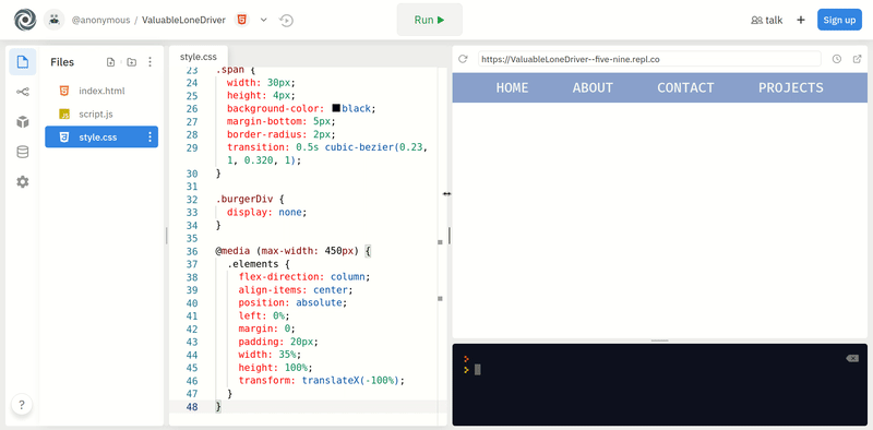
Here, we will make our navbar vertical instead of horizontal and we'll push it off screen.
@media (max-width: 450px) {
  .elements {
    flex-direction: column;
    align-items: center;
    position: absolute;
    margin: 0;
    padding: 20px;
    width: 35%;
    height: 100%;
    transform: translateX(-100%);
  }
}
Explanation: When the screen resolution becomes less than 450px, these styles will get applied. So here, we make the flex-direction of the navbar to column, we align the items to center and we make the position to absolute so it can somewhat float on the browser screen without disturbing other elements on the page.
All the margins are removed and a padding of 20px is applied. The width is set to 35% so it will take 35% width of the screen. height is 100% so the navbar is spread throughout the page vertically.
A transform property is applied which specifies the element's x position on the screen. The element is -100% in the x direction (which is offscreen).
Now if you click 'RUN' and if the preview window's width is more than 450px, you'll see everything normal. Try shrinking down the preview window and at a point, you'll see the navbar go offscreen vertically.
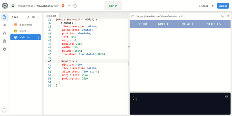
Next, we will also make the burger button visible as it is set to display: none;
@media (max-width: 450px) {
  ... // rest of the code above

  .burgerDiv {
    display: flex;
    flex-direction: column;
    align-items: flex-start;
    margin-left: 20px;
    padding-top: 20px;
  }
}
Explanation: When the screen resolution gets smaller than 450px, we set the burger button's display to flex, flex-direction to column and also align it to flex-start so that it is on the top left corner of the page.
That is pretty much it for the media query and let's test it out. We'll see that the burger button pops up in the corner and the navbar gets shifted off screen.
Your code so far:
* {
  margin: 0;
  padding: 0;
}

.elements {
  display: flex;
  justify-content: space-evenly;
  list-style: none;
  padding-top: 10px;
  padding-bottom: 10px;
  color: whitesmoke;
  font-weight: 500;
  font-size: 20px;
  background-color: #89a0ce;
  transition: 0.5s cubic-bezier(0.075, 0.82, 0.165, 1);
}

.rows {
  cursor: pointer;
}

.span {
  width: 30px;
  height: 4px;
  background-color: black;
  margin-bottom: 5px;
  border-radius: 2px;
  transition: 0.5s cubic-bezier(0.23, 1, 0.320, 1);
}

.burgerDiv {
  display: none;
}

@media (max-width: 450px) {
  .elements {
    flex-direction: column;
    align-items: center;
    position: absolute;
    margin: 0;
    padding: 20px;
    width: 35%;
    height: 100%;
    transform: translateX(-100%);
  }
  .burgerDiv {
    display: flex;
    flex-direction: column;
    align-items: flex-start;
    margin-left: 20px;
    padding-top: 20px;
  }
}
Outside the media query, We'll add some styles to the classes which don't even exist.
Wait what? why?
--> To waste your precious time.
Okay... Okay... Just kidding... That non existing classes hold some importance. FINE? Oh God. I'm not wasting your precious time...
Let's start by adding styles to a class named sidebar.
.sidebar {
  transform: translateX(0px);
}
And more styles.
.line-0 {
  transform: rotate(45deg) translate(4.5px, 12px);
}

.line-1 {
  transform: scale(0);
}

.line-2 {
  transform: rotate(-45deg) translateY(-7.5px);
}
And more styles.
Just kidding that's it. 👀
Explanation: Remember we placed our navbar offscreen? Yes, so to bring it back on screen, we defined the class sidebar which will transform its x position from -100% to 0. We will toggle this class into our navbar using JavaScript later.
Also, the next three classes are defined with the purpose of bringing an animation in the button when it is clicked. We will rotate the first and the third line of the burger button so that it will look like a close button (X). The middle line gets hidden as we scale it down to 0. This will also be toggled using JavaScript.
Refer here for the CSS code so far.
And with dozens of lines of CSS code, let's move on to JavaScript.
3) JavaScript
Honestly, there are just nearly 10 lines of code. So hang tight and don't freak out!
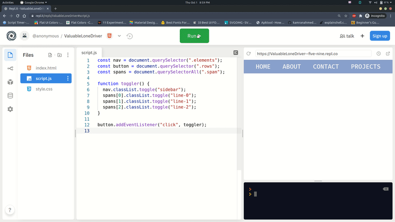
First we will link the navbar, the burger button and each line of the burger button to some variables. Confused? You'll get it in a moment.
const nav = document.querySelector(".elements");
const button = document.querySelector(".rows");
const lines = document.querySelectorAll(".span");
Explanation: The first variable nav contains the whole navbar. The second variable button contains the whole burger button.
Notice that we used querySelector() for the first 2 variables but querySelectorAll() for the last one.
Now first of all, what even is a querySelector()?
The querySelector() returns the first element within the document that matches the specified selector(s).
So, querySelectorAll() returns all the elements that matches the specified selector. Just like that, in the 3rd line, all the elements with the class of span get selected and they are stored in a NodeList.
Now NodeLists are somewhat similar to Arrays and Objects but they are not Arrays or Objects. We don't need to go deeper into it but if you want to learn more about it then check this out.
So that means all 3 of the burger button lines are now stored in the lines variable.
Next, we will create a toggler() function and we will toggle the styles and animations (which are stored in the extra classes which we made).
function toggler() {
  nav.classList.toggle("sidebar");
  lines[0].classList.toggle("line-0");
  lines[1].classList.toggle("line-1");
  lines[2].classList.toggle("line-2");
}
Explanation: The navbar will get a class of sidebar when the function will be called for the first time and that class will get removed when the function will be called the next time.
Also, as the lines variable is a NodeList, we can access each element in it using its index. So, the first burger button line gets toggled with the class of line-0 and in the same way the next two lines get toggled with their respective classes.
Now, we need to call this function every time the button gets clicked, so we will add an event listener on the button outside the function.
button.addEventListener("click", toggler);
Explanation: Now, whenever the button will be clicked, the toggler() function will be called.
And with this, we finish our project! Check out what you've just built!
Part 4: The End
Now I hand this project to you! Its totally yours now!
If you haven't created an account on repl.it, make sure you do so to save this wonderful piece of creation!
If you still face difficulties in signing up watch this.
Here are some things which you can do:
-
Try to upgrade all the navbars you've ever built referring to this workshop!
-
Try to implement it in such a way that its always a sidebar and not in the top!
-
Try to make the navbar popup from the top or bottom, instead of from left.
-
Try to think of more unique ideas on how you can enhance this project.
Some more examples for you
Now that you have finished building this wonderful project, you should share your beautiful creation with other people! Remember, it's as easy as giving them your URL!
You probably know the best ways to get in touch with your friends and family, but if you want to share your project with the worldwide Hack Club community there is no better place to do that than on Slack.
- In a new tab, open and follow these directions to signup for our Slack.
- Then, post the link to the
#scrapbookchannel to share it with everyone! Also ping me with what you've built!
PS: I'm @fayd on slack!