
Join Hack Club Horizons! Ship your projects and fly to your first hackathon →
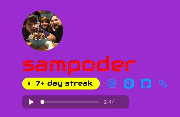
^ what's going to happen when people see your Scrapbook
One of the amazing things about building projects for the web is just how easy it is to make it beautiful! To style web projects, we use a language called CSS. It lets us do everything from changing to background colour to animating text!
Today, we’re going to be learning about CSS by customizing a Scrapbook profile (^ like mine above). Scrapbook is a platform where Hack Clubbers can share photos of what they make or just of their daily life. If you don’t have a profile, log in to the Hack Club Slack, visit the #scrapbook channel, take a photo (or use an old one) and post it!
Next up, you are going to want to open up the Scrapbook Customizer. Type in your username at the top, and delete any code in the right column. Click ‘Go’.
We’re now ready to get started!
Magical Colours!
To make setting colours easier, Scrapbook uses CSS variables. CSS variables work like variables do in any other programming language. You define the variable and then instead of pasting the value in everywhere you add var(--variable-name). This makes it so that if you want to change a theme colour (like we're doing today!) you can do it with one line.
For Scrapbook there are 3 key colour variables that we’re going to want to play around with today. These are the background colour, the colour of text and the colour of the posts (referred to as colors-elevated below).
To tell the web browser the exact colour we want, we can use either Hex codes, or RGB values. For this workshop, we’re going to use HEX codes. To help us get those, we can Google “colour picker”. From here, you can play around with the slides and choose your preferred colour. Choose 3 colours to be used for the profile.
Then in the right column, type:
:root {
  --colors-background: YOURCOLOUR;

  --colors-text: YOURCOLOUR;

  --colors-elevated: YOURCOLOUR;
}
Replace YOURCOLOUR with the Hex codes you found, make sure to include the hash (hashtag) symbol at the start.
You may still see some grey, these are elements that use the --colors-muted variable, can you work out how to change them based on what we learnt above?
I used these colours:
:root {
  --colors-background: #a633d6;

  --colors-text: #fff;

  --colors-elevated: #228b23;
}
To create:
Fancy fonts ❡
What if your Scrapbook was in cursive? Or in a crazy techno font! Fonts can give your page a lot more character, so let’s switch them up.
Google Fonts is a great place to get started, scroll through all their fonts and find one you like! Click it and then for each of its styles click “Select this Style”. Then in the bar that has popped up on the right, click Embed and choose @import. Copy the first text box without the <style> tags. You should have something like:
@import url('https://fonts.googleapis.com/css2?family=Roboto:ital,wght@0,100;0,300;1,100;1,300&display=swap');
As we’ve most likely chosen different fonts, don’t worry if our links are different. Now paste this text snippet into the top of your code file (what you were writing on the right side).
Similar to colours, Scrapbook uses CSS Variables to make it super simple for us to change the fonts.
Add the following code snippet just below the --colors-elevated line.
:root {
  --colors-background: YOURCOLOUR;

  --colors-text: YOURCOLOUR;

  --colors-elevated: YOURCOLOUR;

  /* Add this code below */

  --fonts-body: 'Font name', system-ui, -apple-system, BlinkMacSystemFont, 'Segoe UI';
}
Replace ‘Font name’ with the name of your font, just keep the quotes! We’ve left the other fonts there as a backup for if the font we want won’t load. These are called Fallback Fonts
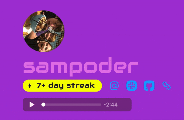
I went techno style, with the Audiowide font.
Crazy CSS Animations - Part 1 ✌︎
We’ve got a fancy font and some magical colours but this site still needs some jazzing up! Let's animate it! First off, we’re going to make our text rainbow animated.
Animations are made with keyframes, where you set the state of the object (in CSS properties) at different stages of the animation. If you've got any experience with video animation, keyframing works very similarly here!
Let’s define that animation:
@keyframes rainbow {
  14% {
    color: red;
  }
  28% {
    color: orange;
  }
  42% {
    color: yellow;
  }
  56% {
    color: green;
  }
  70% {
    color: cyan;
  }
  84% {
    color: blue;
  }
  100% {
    color: purple;
  }
}
What this does is, 14% through the animation it will be #ff0000 (red), 28% through the animation it will be #ffa500 (orange) and so on…
Now, we need to tell the web browser which element should have the animation applied to it. How we identify an element is with a class name and a . before it. To start we want to type this:
.header-title-name {
}
In between the two curly braces, we can type stuff that changes what all the elements with the class: header-title-name have. Inside of this, let’s ask the web browser to add our animation to the element. We can do this by adding this:
animation: rainbow 5s infinite;
We want to add this inside the curly braces. What this does is apply the rainbow animation and run it for an infinite amount of times for 5 seconds each.
Here's what I got:
I’ve got a challenge for you. Let’s make that profile picture spin!
Here are a few things you’ll need to know:
- The class for the profile picture is
header-title-avatar - To rotate a image use:
transform: rotate(20deg)
So can you do it? The solution is here.
Crazy CSS Animations - Part 2 ✌︎
Animations can also happen when you hover over an element as well. This is through pseudo-classes, a word that you can add to your selector to specify a specific state. For example, .header-title-avatar :hover applies when the avatar is being hovered over.
What we're going to do in this section is to have it so that when we hover over a post it gets bigger. As each post has a class of post we can do this with the following:
.post :hover {
  transform: scale(1.02);
}
However, when we do this it's very abrupt and not at all smooth.
To fix this we want to add this to our CSS:
.post {
  transition: all 0.2s ease-in-out;
}
What this does is that it means that the change will transformation will ease in and out, making it buttery smooth!
Hacking
It's time for you to control, there are so many epic things you can do with CSS! So go forward and make your Scrapbook unique to you!! Here a few guiders:
- Make a gradient background. You won't be able to do this with the CSS variables but you can by applying the background to the body tag instead. I'm saying too much, this article explains CSS gradients!
- Swap out text on site with CSS. Check out this article on the subject to get a better sense of what I'm talking about! That's what I call a hack ;)
- Animate everything! You've seen how we can animate elements in CSS but we've really only changed the colour and made something bigger. There are so many more properties that are animatable, check out this extensive list. Also, check out my classes reference just below so you know how to change each element on the page.
Publishing
To publish click Add to Gist. Copy the link. Now hop over to the #scrapbook-css channel in Slack and paste the link into a new message to apply it to your scrapbook!
Once you're done making your profile pretty, how about sharing it in #scrapbook? Tag me (@sampoder), I'd love to see it!
Reference Guide
Here are all the classes you'll need to know to make a splendid Scrapbook:
headeris the entire section above your posts.header-col-1is the section with your avatar, name, streak (if set to display), social links and profile audio (if set).header-title-avataris your avatar, it is a<img>.header-title-nameis the heading with your name.header-contentcontains all of your social links and your streak (if set to display).header-streakis the indicator of your streak.header-linksare your social links.header-linkis a social link, there are likely multiple in the links section.header-webringis a section that contains each person in your webring if you've created one.header-webring-mentionis a mention of a person in your webring, there are likely multiple in the webring section.header-chartis the chart that shows how often you post.postsis the section with all your posts.postis a post.post-headeris the part of the post with the date / time.post-attachmentsis the section with each image, video or audio file you've attached to your Scrapbook post.
Inspiration
To finish off, I'd like to leave you with some amazing customized Scrapbook profiles.
- The god of Scrapbook profiles: Caleb's scrapbook is too amazing for me to describe. Honestly, just check it out. Source code
- Ghoshwolf has made a retro-themed Scrapbook. Source code
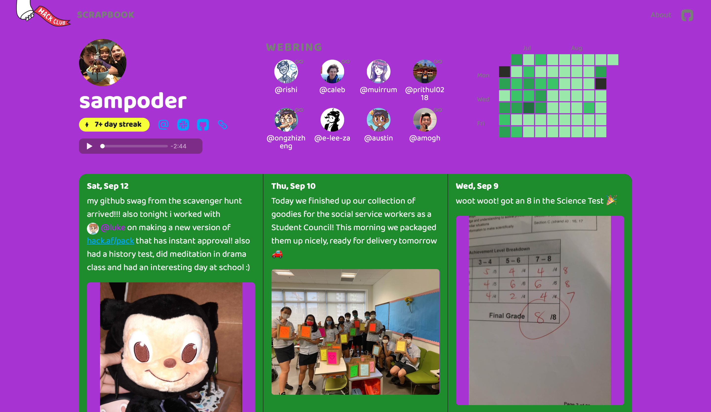
- Yash Karthik has made a purple Scrapbook, with a few hidden gems. Source code
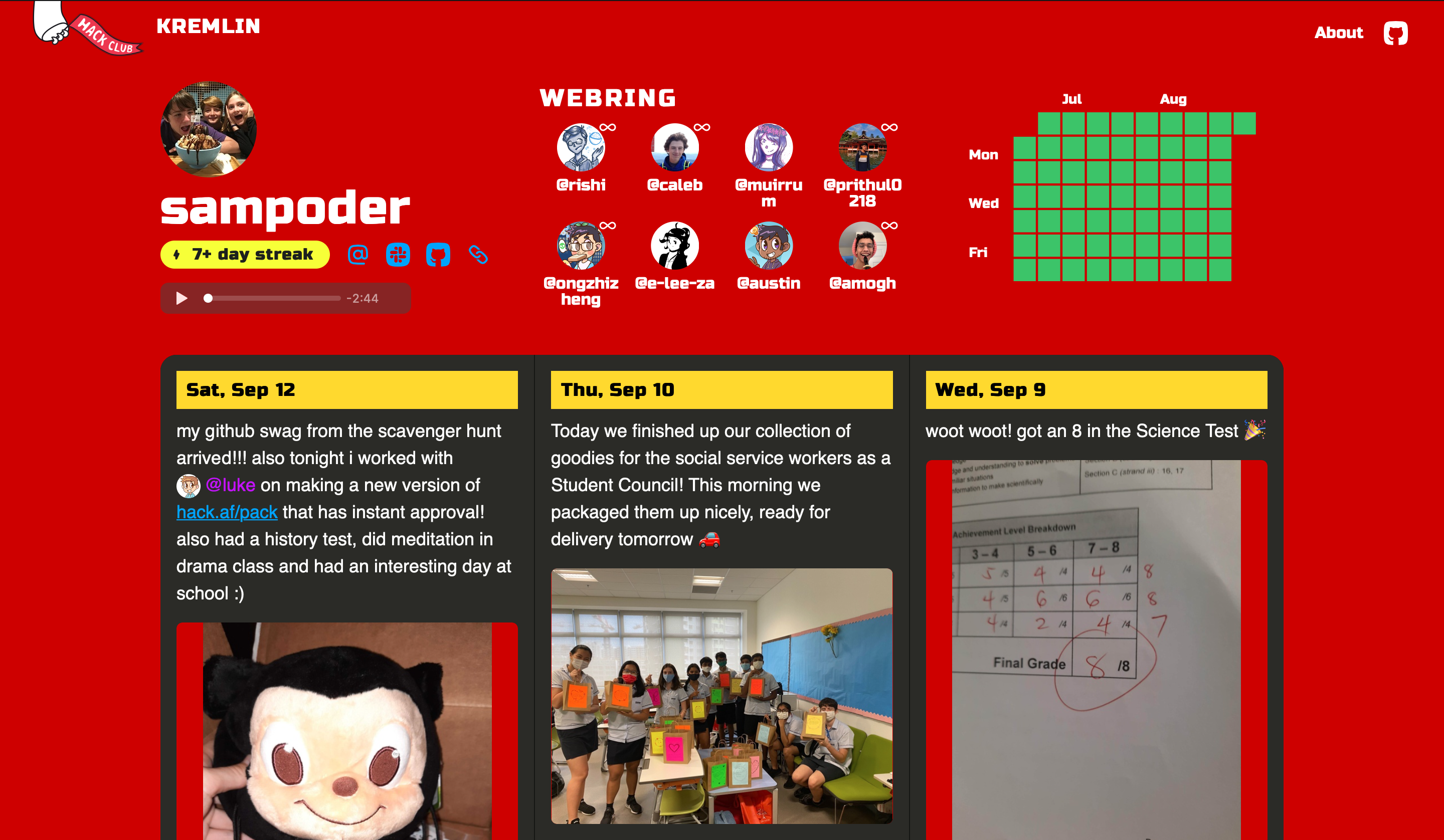
- I also have my own customized Scrapbook profile! The theme is always changing, at the time of writing it's Soviet themed. Source code
I truly hope you enjoyed this workshop, happy hacking!
Spinner Solution
@keyframes rotate {
  0% {
    transform: rotate(0deg);
  }
  50% {
    transform: rotate(180deg);
  }
  100% {
    transform: rotate(360deg);
  }
}

.header-title-avatar {
  animation: rotate 5s infinite;
}